Intoduction to GIS - GIS4043

Wednesday, April 27, 2016

Final Project

Cartographic Skills Final Project


         For the past twelve weeks, in the GIS3015 Cartography Class, we have been learning how to design maps using different skills. We learned basic cartography skills, we learned to critique maps, and design maps. We also learned about Datums, Coordinate systems and projections. We worked with typography, introducing map elements; land partitioning systems, as well as spatial statistics that helped us develop more elaborated maps. In addition, we were introduced and were able to practice with many thematic methods.

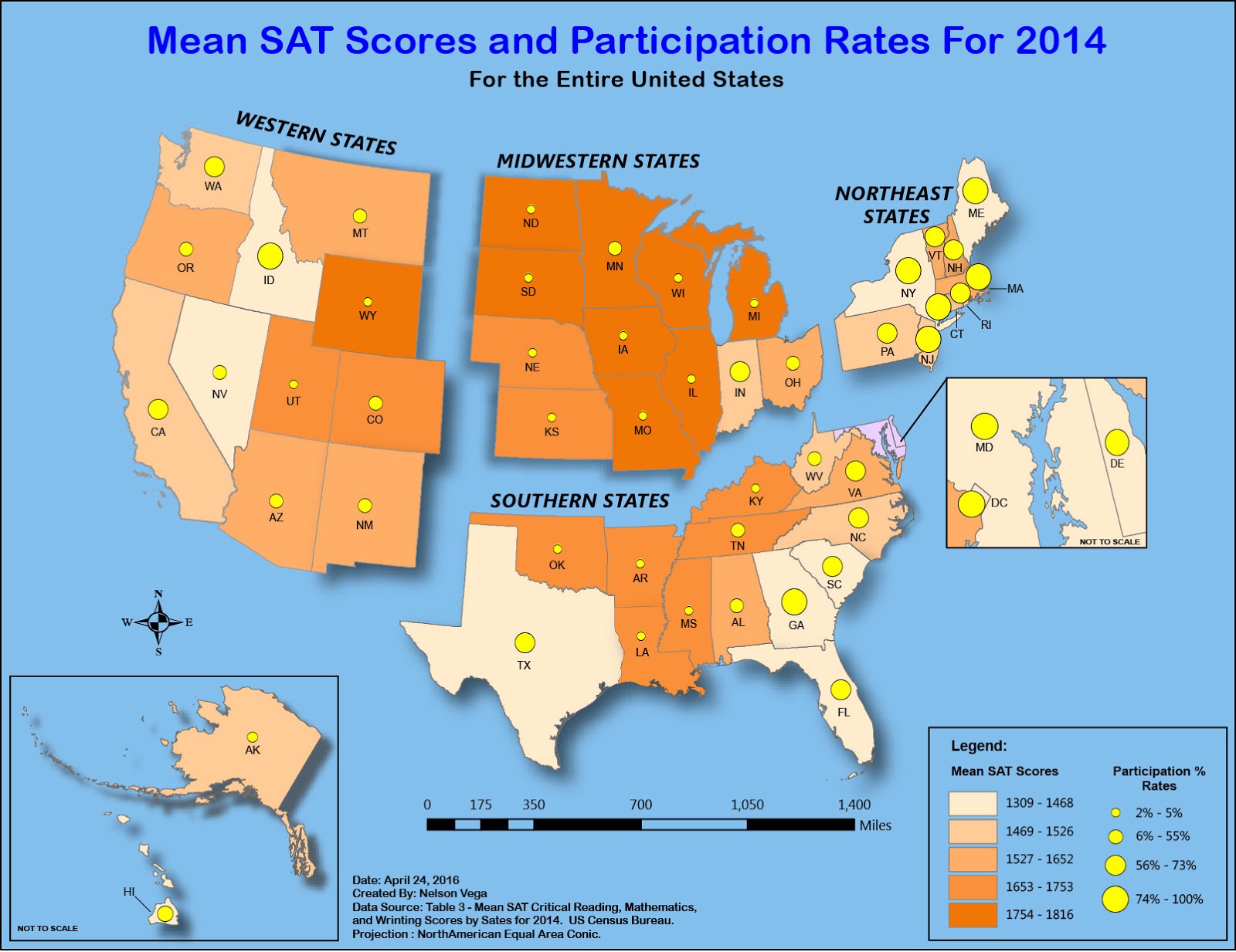
          All these skills, specifically the thematic methods, helped me create this final project map. This map was created to show college entrance exams scores for the United States by state, for the 2014 SAT scores.

          The scores are collated by test participation and the mean score totaled for critical reading, mathematics, and writing scores are shown by state. Next, the states where broken up into four sections allowing for better visual understanding at the glance of even an inexperienced eye, which was the goal in creating this specific map.

          In the preparation of this map, I chose a bivariate choropleth thematic method. This specific type of thematic method, allows you to combine two colored choropleth maps into one map. This technique allows for complementary colors and is easy for the map reader to understand the information.

Sunday, April 10, 2016

Google Earth

Module 12 – Google Earth

For this week’s assignment, we were asked to convert a Dot Density Map of Southern Florida population that was done for module 10 in ArcMap10.3 into a KMZ / KML file format using ArcMap10.3 conversion tool kit. We also needed to make a simpler version of the legend to convert to a KML file because the conversion would ignore most of the symbology setting applied to the layer from ArcMap. We also used placemarkers and recorded a tour using Google Earth.

We first converted the dot density map to Raster KMZ file and then converted the dot density layer to a KML file format.  We then opened the converted file in Google Earth and we had to make some adjustments. One of the adjustments was to the dot density map to Raster from solid fill to outline. We then added the dot density layer. This layer gives you the legend. Google Earth only allows to chose from a list of locations as to where the list of the legend will be placed on the screen.

We then had to create some placemarkers in Google Earth. They look like push pins and you can move them to any location on you map and give them a title and color or shape from a list. We created eight of them from the Miami metropolitan area to St. Petersburg and locations in between.

We recorded a tour using Google Earth. A record tour lets you use the placemarkers as at points for the movie. Once you started recording you would click on a placemarker and you would start zooming in to that location. You are able to slow down the zoom if you wanted to and you could also turn around on any direction you wanted and turn on or off the 3D building in the area. Then click your next placemarker. At the end you were asked to save the move to a KMZ file.


Sunday, April 3, 2016

3D Mapping

Module 11 – 3D Mapping

For this week’s assignment we were introduced to 3D mapping thru an ESRI training course online. On that course, we learned some new key terms like 3D Features, Extrusion, and Triangulated irregular Network (TIN) among others. We were also introduced ESRI Arc Scene and Arc Globe. Our lab instructions reinforced what we had learned from the online training course and we also learned how to export to KMZ/KML file for uses on Google Earth.

3D Features - Is a representation of a three-dimensional, real-world object in a map or scene, with elevation values (z-values) stored within the feature's geometry.

Extrusion - Is the method of projecting features in a two-dimensional data source, into a three-dimensional representation.

Triangulated irregular network - A vector data structure that partitions geographic space into contiguous, non-overlapping triangles. The vertices of each triangle are sample data points with x-, y-, and z-values.

For our lab exercise, we were asked to convert 2D building layers to a 3D features. The information is of buildings in the Boston, Massachusetts area. The shapefile and the Boston.tif file are from Mass.gov/Mass GIS. The files contain information on building polygon layers and elevation data, to help create a 3D representation of the buildings.

After working thru the lab and creating 3D representations of buildings in the Boston area, we were asked to export our work as and KMZ/KML file which you can be opened in Google Earth.

I enjoyed this week’s assignment very much. I liked being able to create 3D features and I also learned it takes lot of information to come together to be able to create a 3D features.  I have used KMZ/KML files for my job with the city.  I have only done it in 2D it has come in very handy.  In addition, I have been able to send the utilities department files showing the approximant location of the sewer manholes and hydrants, and updated city limits so they can use it in Google Earth.


Saturday, March 26, 2016

Dot Mapping

Module 10 – Dot Mapping


For this week’s assignment we were asked to create a dot map (also known as a dot density or frequency map).  We were asked to import the South Florida shapefile into AcrMap 10.3 which only showed the 23 counties of the state. We then imported an excel spreadsheet that contained population data for the counties; we then join the files by county names. We also added urban land and surface water shapefiles and locations of some major cities.  We were also asked to add a north arrow, legend, scale bar and title to the map.

Dot maps can be represented as one-one, which would be better for smaller geographical areas or one-many, which is better for larger geographical areas.

Dot / Density maps can only use conceptual or raw data. When using dot mapping, some criteria should be considered: when you have discrete data occurring at points, when you want to compare distributions of related phenomena, and when you want to portray variations or patterns in density.

There are some advantages to dot maps that are very easy concepts to understand: for example, they are effective for showing variations of phenomena that exist in large quantities. This type of map is most commonly used in the agricultural maps.

There are also some disadvantages: it is hard to estimate density, and the map reader could interpret the dot to represent a single occurrence.  This type of map should not be used for large scale maps or when your data is continuously distributed.

This was a good and at the same time a frustrating assignment. On the good side, I liked bringing  in and joining two different file types to create one larger data file to pull the data from. On the frustrating side were the dots and trying to get them to fall in the proper place. There where many times the dots were all over the map, therefore I had to go over the lab instructions several times before they finally fell in to place.


Sunday, March 13, 2016

Flow Line Mapping

Module 9 – Flow Line Mapping


For this week’s assignment we were asked to create a flow line map in Adobe Illustrator using data from the U.S. Department of Homeland Security the data concentrated on 2007 immigration numbers.  We were given two different layouts to choices from I chose base map “A” with a Choropleth inset map of the U.S. immigration per state.

This was not an easy lab assignment for me I am not very good at using Illustrator yet it toke a lot of practices and a couples of training videos to understand how to use the pen tool to make lines with curves.  I made many ugly looking lines until I got them looking pretty good and smooth.  Each flow lines reflected the immigration size from each continent the large the immigration the thicker the line and arrow head.

For this assignment the lab instruction where the biggest help they had a lot of information on how to work in Illustrator I know I will be going back to for other labs using Illustrator.


Sunday, March 6, 2016

Isarithmic Mapping

Module 8 – Isarithmic Mapping

On this week’s assignment we were asked to create an Isarithmic map using a geodatabase from the USADA Geospatial Gateway in AcrMap 10.3.The data shown represents Washington State and the annual amount of precipitation that has occurred over a twenty year period from 1981 – 2010.

As you worked through the lab excurses you learned about PRISM (Parameter-elevation Relationships on Independent Slopes Mode), which is an interpolation method that shows an account for the major physiographic factors. It incorporates elevation surfaces by utilizing digital elevation model (DEM). This is done by calculating a climate elevation regression for each DEM grid cell.  Monitoring locations collect the data that take into a count elevation, coastal proximity, topographic orientation, and vertical atmospheric layers.  We were also asked to add contour lines which help you see the highs and low points as well as slopes and valleys of the area.


Sunday, February 28, 2016

Choropleth and Proportional Symbol Mapping


Module 7 – Choropleth and Proportional Symbol Mapping

For this week’s assignment we were asked to create a Choropleth Map Wikipedia" This it as a map that provides an easy way to visualize how a measurement varies across a geographic area as well as showing the level of variability within a region.  The data source for the map was a geodatabase (gdb) for Europe – NUTS Nomenclature of Territorial Units for Statistics and Wine Institute for 2012.  I used AcrMap 10.3 to setup the map with the classification color scheme and proportional/graduated symbols. We needed to add an inset map and a north arrow, scale bar, and legend to the map.  I exported it as AI extension (Adobe Illustrator).

The map below shows wine consumption in Europe by population density.  For this map I chose a dark green to light green for my classification color scheme, and flame red circles for the proportional/graduated symbols.  I used Quantile classification for this map. Quantile: Divides the total data range into equal numbers of observations, then the values are placed into groups by their numerical order.

This map took me a long time to complete. I am still new to Illustrator and trying to understand how the layers work and how to use the program as a whole. I feel more confident, as I gain experience, and I am sure that with time, it will get better.